|
Statistics Target A
|

|
Find the balancing point of this set of data. Describe how you determined the balancing point.
|
Click here to review how to create a box plot, dot plot, and histogram
Analyzing shape of a data set
The shape of a data set looks at the data set to identify if there is any "skewness". A data set is considered skewed if it is asymmetrical with one tail longer than another. The histogram examples below demonstrate negative skew, positive skew, normal distribution, and uniform distribution.
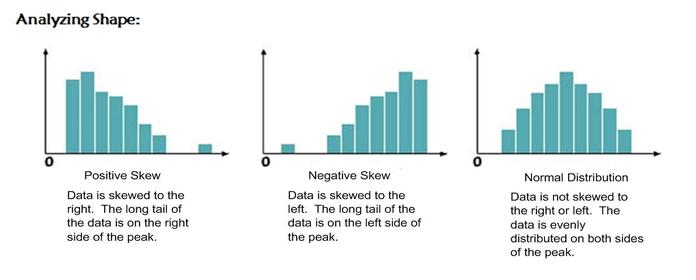
When graphs are skewed the median and mean are no longer equal. When a graph is positively skewed the mean would be on the right side of the peak. When a graph is negatively skewed the mean would be found on the left side of the peak.
Interpreting and Analyzing a Box Plot
Interpreting and Analyzing a Box Plot
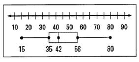
When creating a box plot we use quartiles to divide the data into \(4\) pieces. Each section of the box plot represents \(25\)% of the data. When looking at the box plot above, from \(15\) to \(35\) represents \(25\)% of the data. The "box" part of the plot has \(2\) sections that represents \(50\)% of the data. The interquartile range (IQR) = Quartile \(3\) - Quartile \(1\). For our data set, the IQR = \(56 - 35\) = \(21\).
Measure of Central Tendency and How Outliers Effect Data
Let's look at the following set of data: \(6, 6, 7, 10, 11, 11, 12, 42\).
If we analyze the data we see that the data point \(42\) is from the rest of the data points (meaning that it doesn't seem to fit with the rest of the data points), therefore it can be considered an outlier. Let's take a look at how an outlier can effect the mean.
mean with outlier: \(13.125\)
mean without outlier: \(9\)
When calculating the mean with the data point of \(42\), the mean is much higher than without the data point. Calculating the mean does not always give you the best representation of the data when there are outliers as part of the data set.
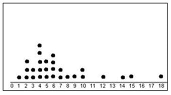
Quick Check
For the following dot plot analyze the shape of the data. Does it have an outlier? If there is an outlier how would it effect the mean of the data?
For the following dot plot analyze the shape of the data. Does it have an outlier? If there is an outlier how would it effect the mean of the data?