|
Writing Linear Functions Target D
|

|
Would you rather decrease faucet use by \( 20 \% \) or take \( 15 \% \) shorter showers?
Whichever method you chose, justify using mathematics. |
When given a set of data, we attempt to find a model that represents the relationship between the two variables. Linear regression tries to model the relationship between two variables (x-variable or independent variable and the y-variable or dependent variable) by finding a linear equation that best fits the data. We can plot data by hand in the form of a scatterplot and then draw a line to best fit the data by trying to fit most of the points on the line. We could then use one of our methods of writing an equation of the line from two points which seem to best represent the data.
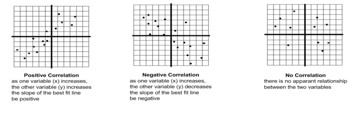
We can describe the correlation between a set of x and y values as follows:
We can describe the correlation between a set of x and y values as follows:
We can also use a graphing calculator and linear regression to find the linear function that attempts to best fit the data. Below is a link to the directions and online calculator in order to use Desmos to find a linear regression.

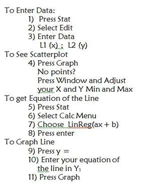
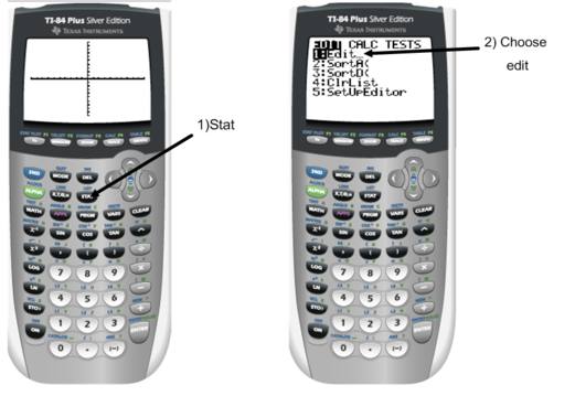
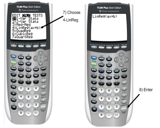
Below are the steps needed in order to obtain the linear regression equation using a TI graphing calculator.
When we use the graphing calculator (including Desmos) it will also give us the correlation coefficient or "\(r\)" value. The correlation coefficient measures the strength of the linear relationship between the two variables. This is one piece of information that will help determine if a linear equation is a "good fit" for your data. If the "\(r\)" value is close to \(1\) then we can say a linear equation is a good representation.
In order to view the correlation coefficient when using the linear regression feature on the graphing calculator, you will need to turn on the diagnostics. Watch the video prior and turn on the diagnostics prior to entering data into the calculator.
In order to view the correlation coefficient when using the linear regression feature on the graphing calculator, you will need to turn on the diagnostics. Watch the video prior and turn on the diagnostics prior to entering data into the calculator.
You will also need to TURN ON THE STAT PLOTS! Watch this video to learn how.
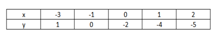
Example 1: Find the linear regression line for the following set of data using your calculator.
First we are going to enter our data into the calculator.
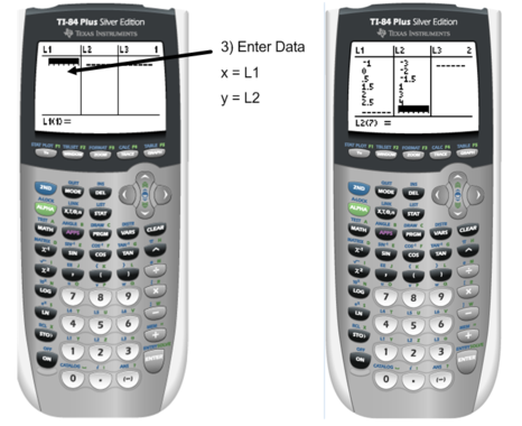
To see the scatterplot, we need to graph the data. You may first need to turn on the stat plot.
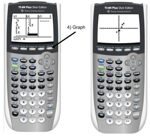
If you cannot see the data click on the link to turn on your stat plot.
If you still can't see your points, you may need adjust the window settings.
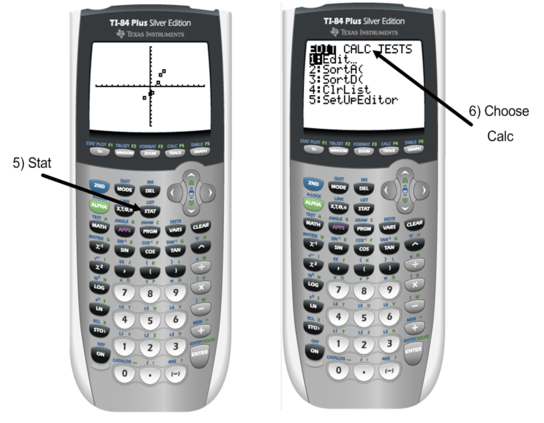
Once the scatterplot is on and we have seen our data we are going to have the calculator find the linear regression line based on our data.
If you still can't see your points, you may need adjust the window settings.
Once the scatterplot is on and we have seen our data we are going to have the calculator find the linear regression line based on our data.
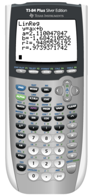
The linear regression equation is: \( y=2.11 x - 1.68 \) with \( r = 0.97 \).
When looking at the \(r\) value, it is relatively close to \(1\) so therefore we would say this regression is a "good fit" for the data.
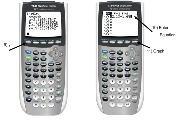
In order to graph the line the calculator just found as our regression equation, we will need to go to the \(y=\) screen and type it in.
When looking at the \(r\) value, it is relatively close to \(1\) so therefore we would say this regression is a "good fit" for the data.
In order to graph the line the calculator just found as our regression equation, we will need to go to the \(y=\) screen and type it in.
Often we find regression equations so that we can predict or extrapolate future situations. In our example a follow up question may be find \( y \) when \( x \) is \( 4 \). In order to do this we will substitute \( 4 \) in for \( x \) and calculate what \( y \) is as follows:
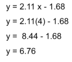
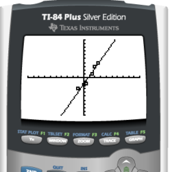
What you will notice that the \( y \) value for \( x = 4 \) fits right in line with the other data points. It is always good to check your prediction with the other data to make sure it makes sense.
Here are 2 video examples for the problem above. The first shows how to use the linear regression feature on the graphing calculator. The second shows how to use DESMOS to find the line of best fit for the data.
Here are 2 video examples for the problem above. The first shows how to use the linear regression feature on the graphing calculator. The second shows how to use DESMOS to find the line of best fit for the data.
Linear Regression on the Graphing Calculator
Linear Regression Using DESMOS
Example 2: The table below represents sales of women's clothing stores in the United States since 2005. Find the estimated sales in the year 2014. In what year were the sales \( 11.533 \) billion in clothing sold.
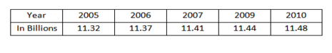
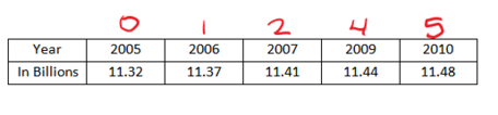
When reading the problem, the table represents the sales of clothing SINCE 2005. That means that the data starts in 2005 making 2005 year \( 0 \). We will then continue to renumber the years starting there, that means year 2006 will be \( 1 \), 2007 will be \( 2 \). Also, since it jumps from year 2007 to 2009 remember to skip a number. So the year 2009 will be \( 3 \).
Now let's follow the same steps as in example 1. If you forget - follow the steps from above. Years would be your "\(x\)-variable" since it is the independent variable where clothing sales in the billions would be your "\(y\)-variable" which is the independent variable.
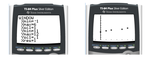
As we get to step 4, we can't see the points. You need to change the window. When changing the window keep in mind the range of your \(x\) values (\(0\) through \(5\)) which provides you an \(x\) min and \(x\) max and since you are just going from \(0\) to \(5\). You should make your \(x\) min a little below your lowest value and your x max a little above so that you can see the entire graph. You should set your \(x\) scl to count by \(1\)'s. The range of your \(y\) values (\(11.32 - 11.48\)) shows you are only between \(11\) and \(12\) counting by tenths or \(0.1\). Below is an appropriate window but it is not the only window that can be used.
As we get to step 4, we can't see the points. You need to change the window. When changing the window keep in mind the range of your \(x\) values (\(0\) through \(5\)) which provides you an \(x\) min and \(x\) max and since you are just going from \(0\) to \(5\). You should make your \(x\) min a little below your lowest value and your x max a little above so that you can see the entire graph. You should set your \(x\) scl to count by \(1\)'s. The range of your \(y\) values (\(11.32 - 11.48\)) shows you are only between \(11\) and \(12\) counting by tenths or \(0.1\). Below is an appropriate window but it is not the only window that can be used.
Continue with the steps and find the linear regression equation: \( y = 0.029x + 11.22 \) with a correlation coefficient of \( r = 0.978 \).
Looking at the correlation coefficient this linear regression equation is a pretty good fit. We will find the approximate number of sales in 2014 through substitution. We will need to use "9" to represent the years since 2014.
Looking at the correlation coefficient this linear regression equation is a pretty good fit. We will find the approximate number of sales in 2014 through substitution. We will need to use "9" to represent the years since 2014.
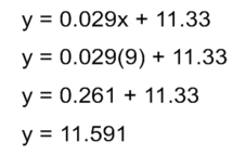
So in the year 2014, the company had \( 11.591 \) billion in clothing sales.
For the second part of the problem, we want to find in what year was \( 11.533 \) billion in clothes sold. This time we need to substitute \( 11.533 \) in for the \( y \) variable and solve for \( x \).
For the second part of the problem, we want to find in what year was \( 11.533 \) billion in clothes sold. This time we need to substitute \( 11.533 \) in for the \( y \) variable and solve for \( x \).
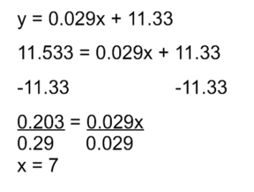
We are trying to find the years since 2005, so the year when \( 11.533 \) billion in clothing was sold will be \( 7 \) years since 2005 or in the year 2012.
Quick Check
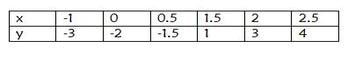
Find the linear regression equation for the following set of data. Is the equation a good fit for the data? If so, find the \( y \) value for when \( x = 4 \).
Find the linear regression equation for the following set of data. Is the equation a good fit for the data? If so, find the \( y \) value for when \( x = 4 \).